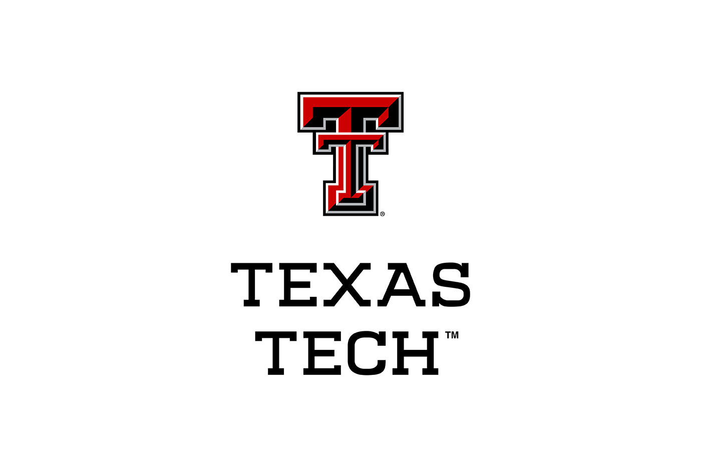
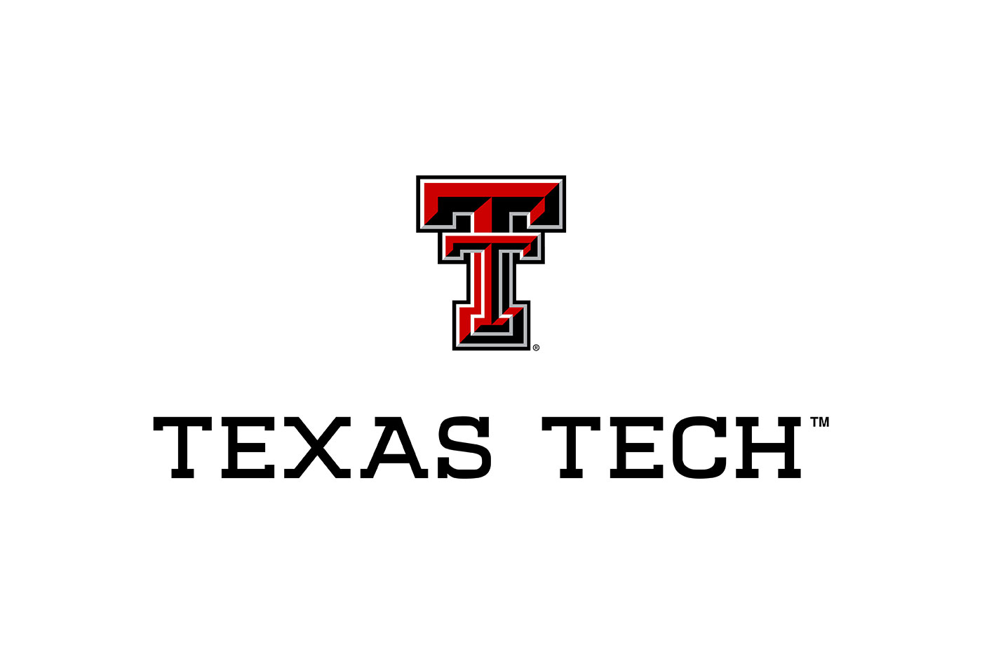
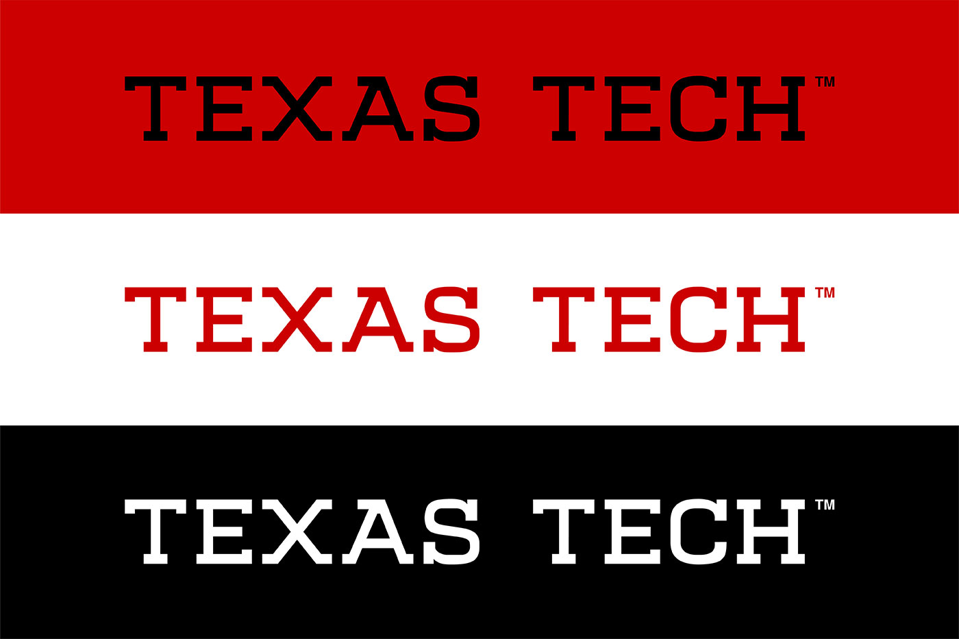
This marks the first thorough revision of the Texas Tech University wordmark in nearly 20 years.
The last time Texas Tech University changed its university logo, Apple was still two years away from releasing its first iPhone and YouTube had just launched.
In the nearly two decades since then, technology and communication have undergone revolutionary change: people with little to no tech skills can now use smartphones, tablets and computers to design things that were previously unimaginable and communicate in ways that were once considered pure science fiction.
These changes have forced Texas Tech University to update its identity guidelines and have necessitated a new word mark that brings the university's brand to the forefront. Today, Texas Tech University unveiled its new word mark, which when combined with the double T, captures the spirit and character of Texas Tech University.
“Texas Tech's visual identity is more than just a logo and a collection of colors; it represents our values, aspirations and commitment to excellence,” said Matt Dewey, vice president of Marketing & Communications. “After months of planning, research and collaboration, we developed a new visual identity system that captures the essence of Texas Tech and where we're headed.”


Texas Tech's new word mark balances the university's history and tradition with a modern, collegiate expression of its name. Its letterform is inspired by the double T, creating a strong, recognizable graphic that boldly emphasizes what Texas Tech is all about.

The Texas Tech brand reflects the university's contemporary innovation, academic advancements, and continued growth and achievements. It also ensures brand consistency across all colleges and departments within Texas Tech, delivering a flexible, yet unified look. The double T, one of the most iconic logos in higher education, will remain unchanged.
For more information about Texas Tech University's new visual identity system, visit the brand's website

